From Information Architecture to Interaction Design: Simplifying Resources for Coaches, Teachers, & Families
Header Start Center For Inclusion
University of Washington and Office of Head Start
Website: headstartinclusion.org
Role: UX design, UX research, project management, branding, front-end development
Team: Jr. Front-End Developer, Content Developers, Media Producer
Tools: Sketch, WordPress, Google Suite, Optimal Workshop
About This Website
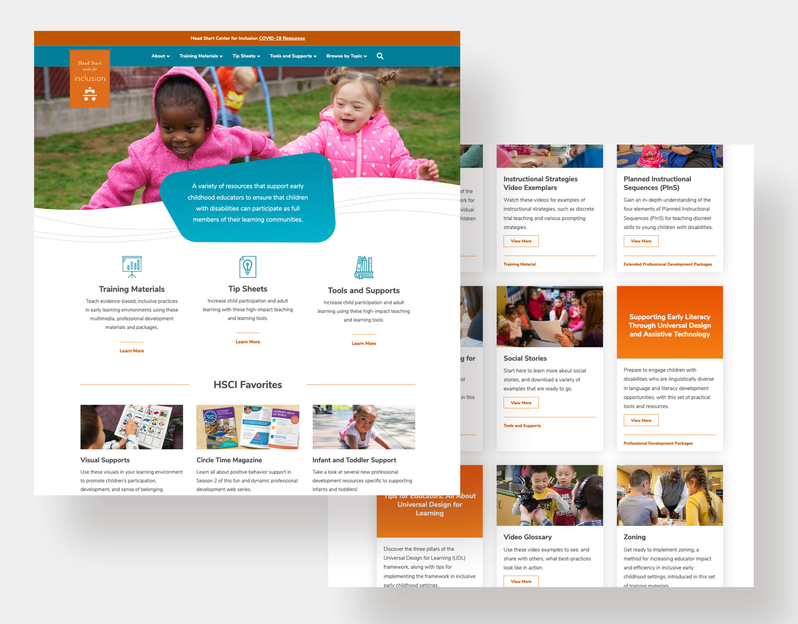
This was a mixed media website with learning resources that supported teachers and classroom staff, disabilities coordinators, supervisors and coaches, trainers, family service providers, and families to ensure that children with disabilities can participate as full members in their learning communities.
Project Brief
The project brief was to improve the user’s ability to effectively find and download resources, refresh the overall design and make it responsive (hello, 2004!), implement a new content management system (WordPress), and make it accessible (WCAG 2.1 AA).
Project Outline
Duration: 14 weeks
Release Date: August 31, 2020

Understand
Stakeholder/leadership business needs
Content audit and analytics
User surveys and interviews
Persona creation
Reverse card sorting
Create
Information architecture
High-fidelity wireframes
Atomic design patterns
Validate
Navigational tree testing
Heatmap testing
User surveys
Iterate
Improved high-fidelity wireframes from findings
Final stakeholder/leadership approval
Final build and release
Meet The Users
The College Professor
Goal: Teaches future educators and supervisors
Uses the site: 1 time per month during active semesters
Most used resources: Handouts, videos, and presentations
Biggest problem: They're not sure where to start. They start in the “Trainers” area of the site but end up poking around other roles to find what they’re looking for.
The Trainer
Goal: Creates courses, training material, and professional development for teachers and education leaders
Uses the site: 1-2 times per month
Most used resources: Visual supports and videos
Biggest problem: Content is buried and it takes a lot of time and clicks to find very specific learning aids they are looking for. They need to view a high volume of resources on the website and need a quicker way to preview these files before downloading.
The Coach
Goal: Trains or coaches teaching staff or families at centers and schools onsite or virtually
Uses the site: 1-2 times per month
Most used resources: Visual supports, tip sheets, presentations, and videos
Biggest problem: The content they need is organized by different roles and they can’t find contact information on the site when they need a video file. They need to view a high volume of resources due to the breadth of subjects when coaching both teachers and families and need a quicker way to preview these resources before downloading.
The Supervisor
Goal: Supervises the work and professional development of coaches and teachers
Uses the site: 2 times per month
Most used resources: Visual supports and tip sheets
Biggest problem: There are resources they use that are not within the "Supervisor" section so they need to weed through other sections in the site to find the resources they are looking for.
The Problem
Finding Resources
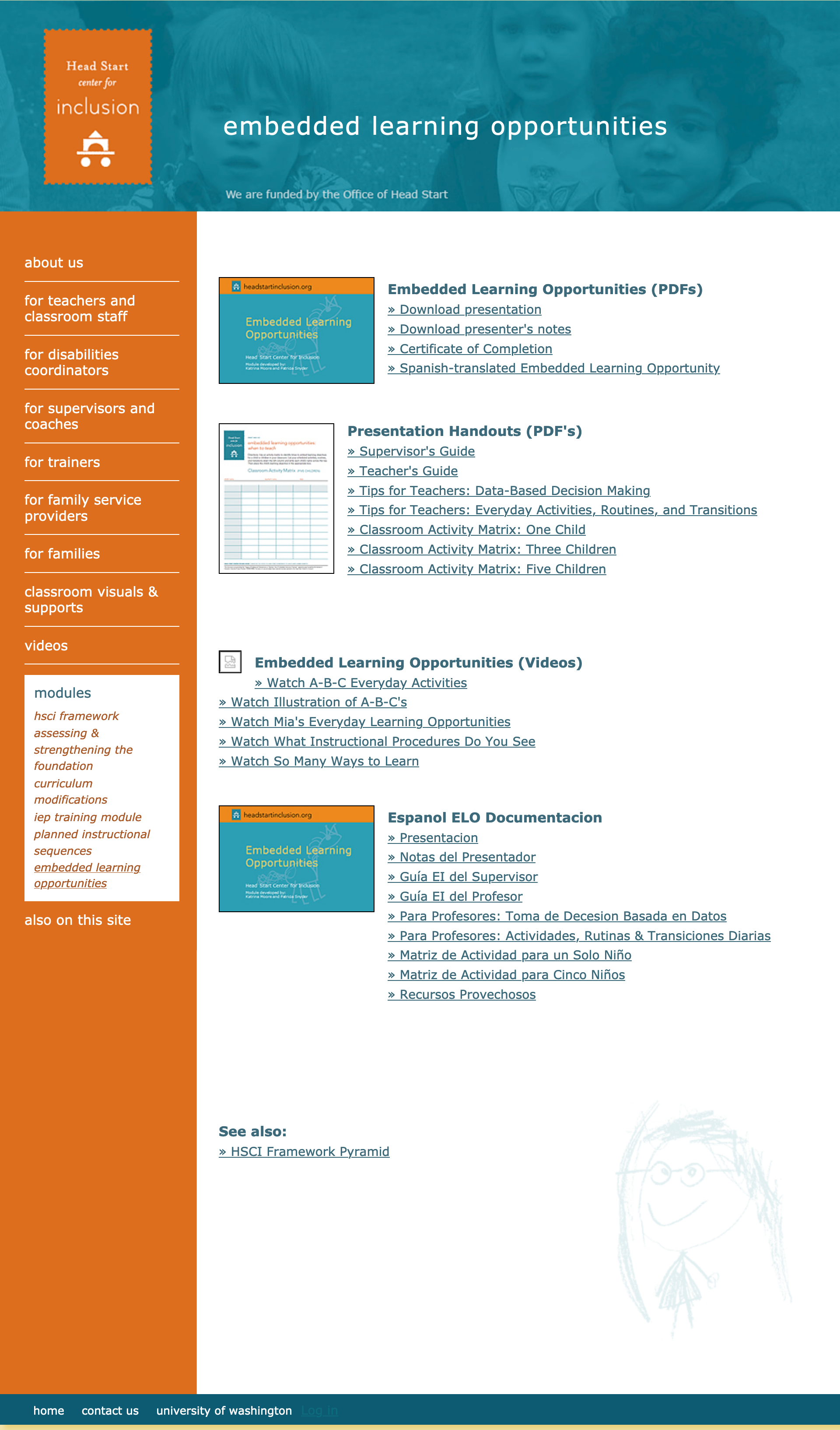
- The website was originally organized by a user’s role within education. During user surveys and interviews, I discovered many resources used in each job role are flexible and not dependent on roles.
- Naming of resource collections were not intuitive to user (ex: 15 Minute In-Service Suites vs Modules).
- Many pages were not linked to the main navigation and required users to drill down two to four levels of navigation within page content to find resources (there were total 76 pages!).
Previewing & Downloading Resources
- Most training packages, PDFs, Word docs, presentations, and videos were listed as text links in long lists and often had no description or images.
- Users were forced to download a file to preview the resource.
- Videos were flash-based and could only be watched on the website by navigation to it's own page. Trainers and coaches needed to download videos to bring onsite with them or add to other systems but had to contact a staff member at UW to receive a copy.
The Solution: Finding Resources
The Process
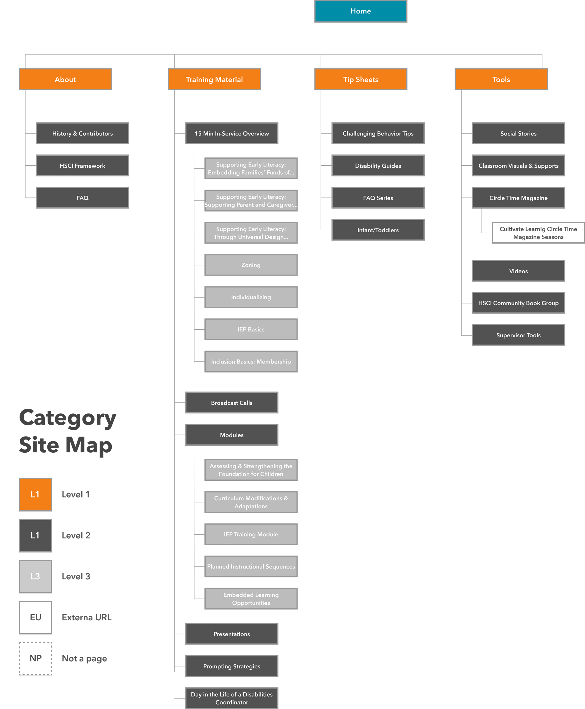
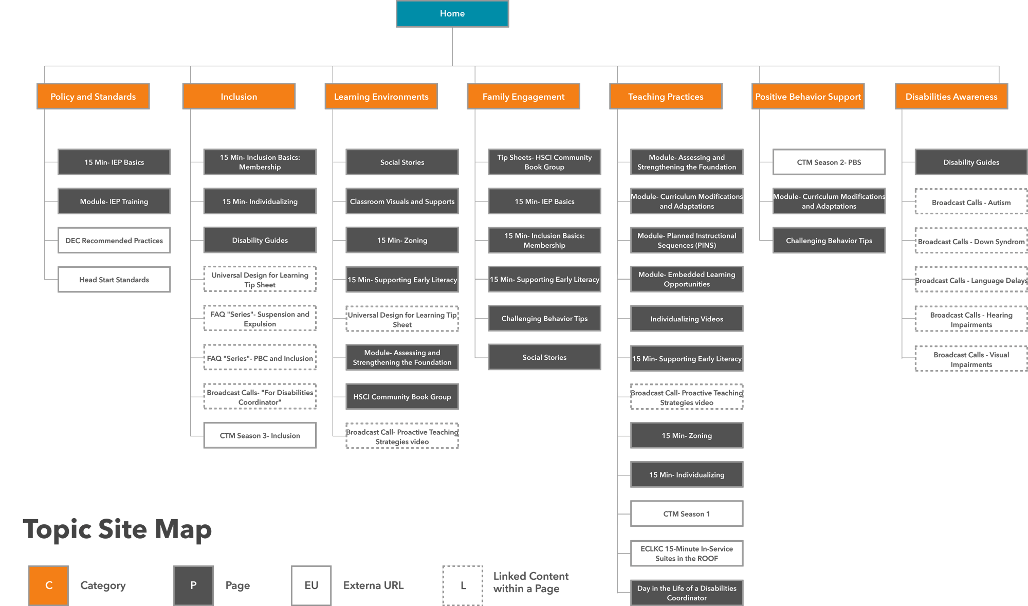
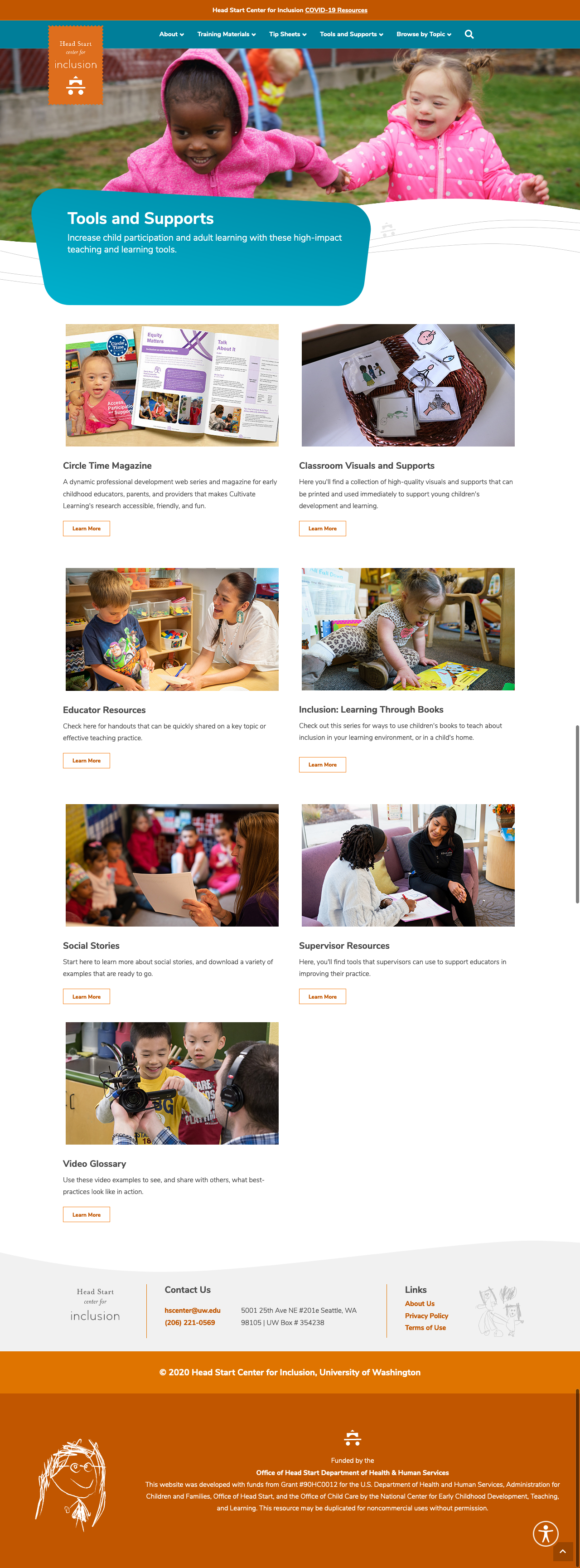
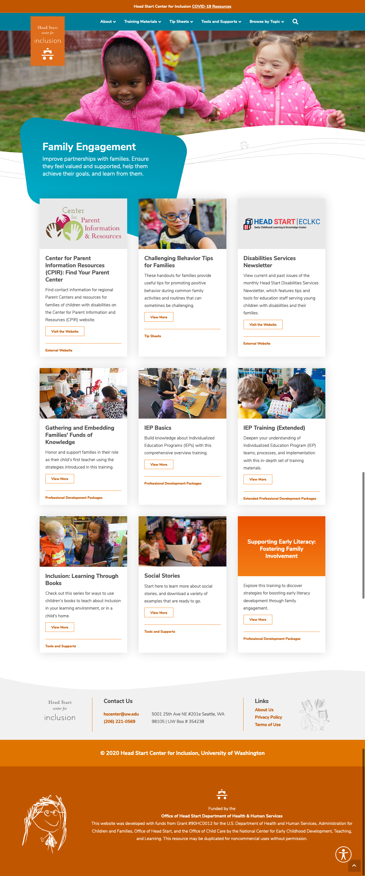
To help users find resources that were critical to their job, I organized the information architecture “By Category” and “By Topic”. "By Category" allowed users to find resources by type and "By Topic" was based on the subject of the content. By having resources findable in both ways, users with different roles such as a supervisor versus a college professor were able to quickly find tip sheets (category) for a specific disability (topic). I used reverse card sorting to test, validate (or not!), and iterate to ensure the success of the new information architecture.
By Category Site Map
By Topic Site Map
The Result
The old site had four levels of navigation and 76 pages. I was able to reduce the site to only three levels with 39 pages and many subcategories were renamed or removed, drastically cutting a user's time spent searching for resources in half. Time spent on category pages was reduced and there was increased engagement on pages that housed resources.
In collaboration with content developers and leadership, we also renamed Modules and 15 Minute In-Service Suites resources. Despite those names being around for a decade, I discovered there was an 80-90% failure rate in reverse card sorting and it took users 56 seconds during Time on Task when testing with prototypes. After renaming these to Professional Development Packages, Time on Task reduced to 13 seconds and only had a 10% failure rate.
By Category Landing Page
By Topic Landing Page
The Solution: Previewing & Downloading Resources
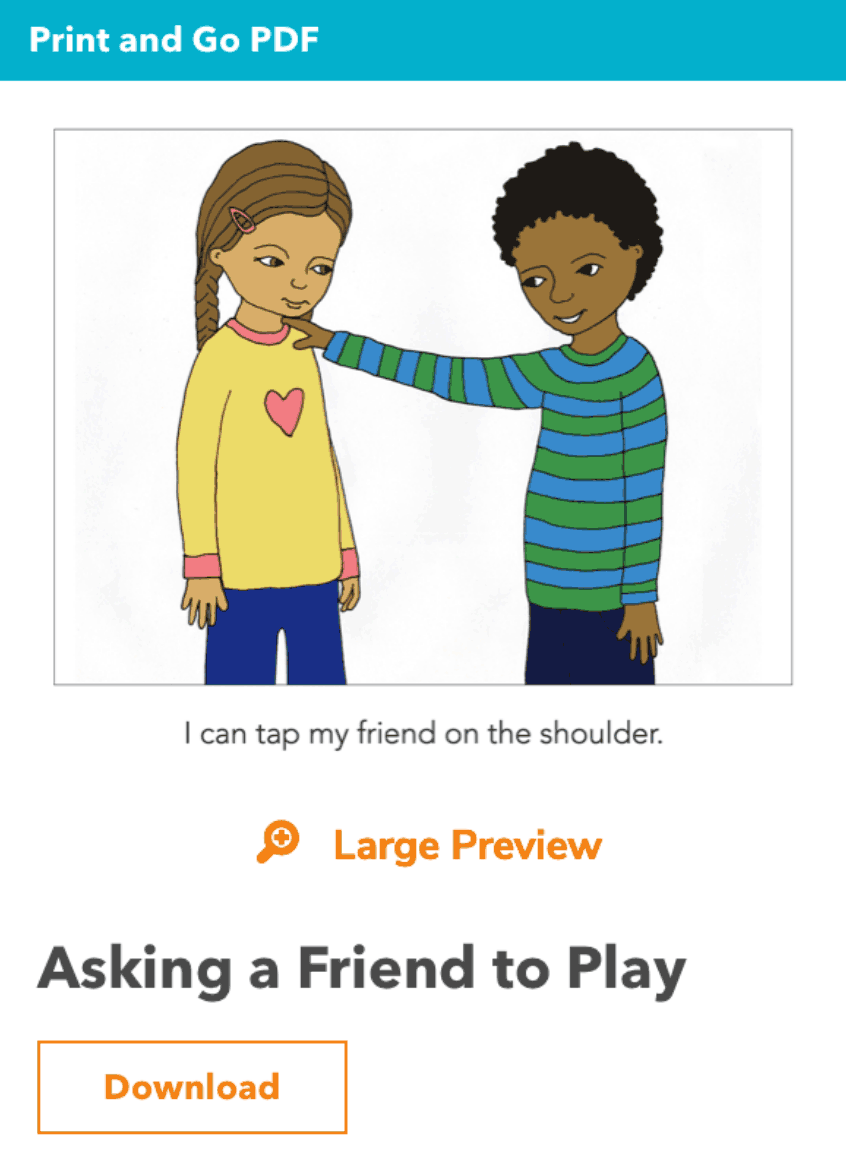
Before Heatmap Testing
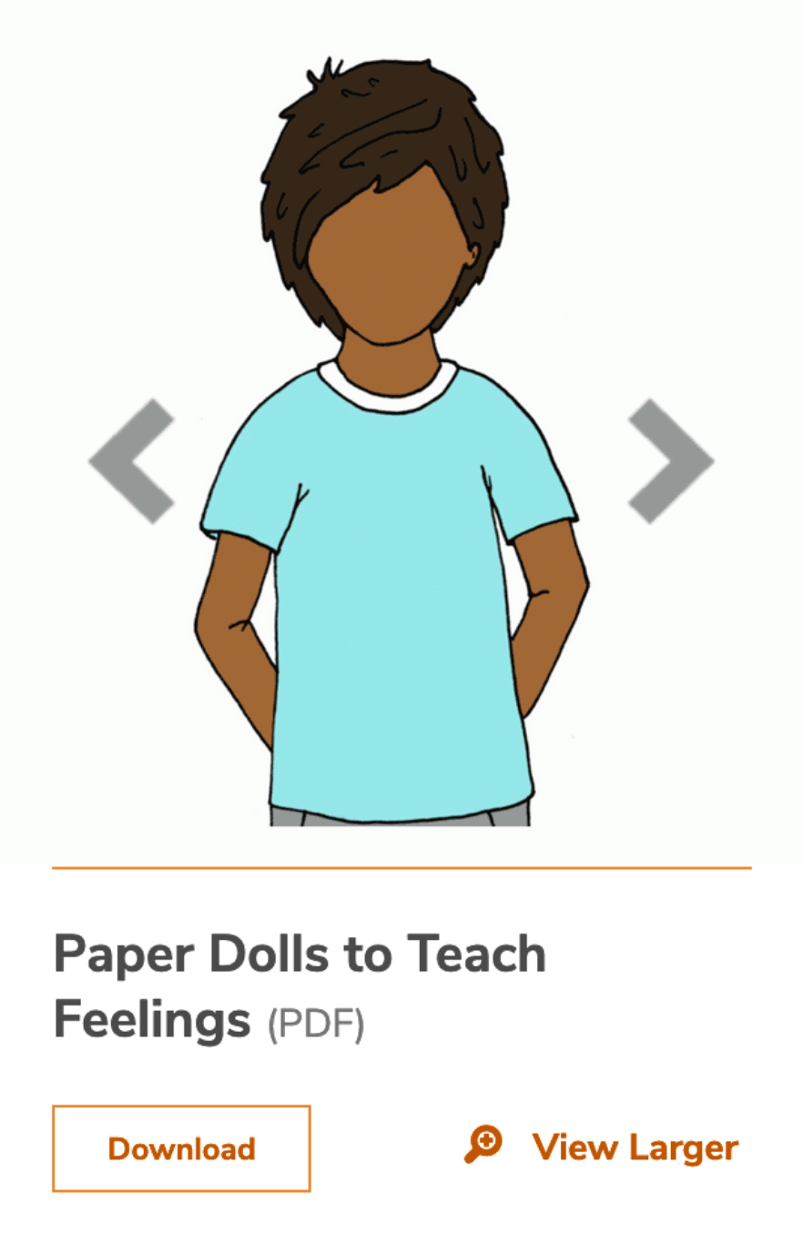
After Heatmap Testing
The Process
One of the user pain points I focused on solving was the need for users to preview resources before downloading them.
During heatmap testing, I learned creating regions and grouping proximity of information and interactions drastically effected the success of actions within the card. Users had a high failure rate in finding the “Large Preview” action in the first design iteration. By moving it to the bottom of the card alongside the download button, users had a high success rate in finding the action.
The Result
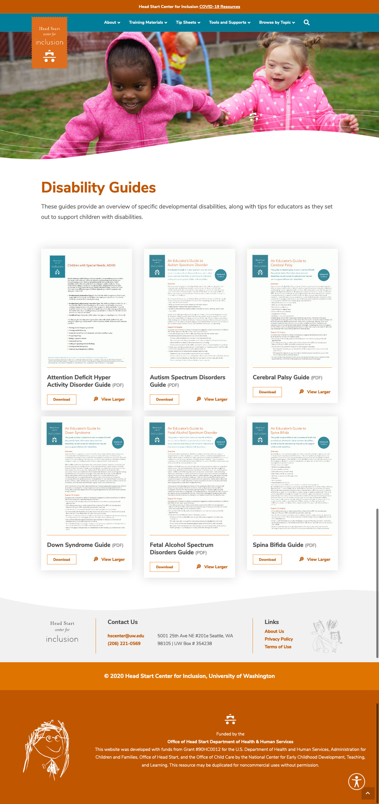
For downloadable PDFs, presentations, and Word documents, users are now able to:
- Quickly shuffle through thumbnails to see a quick glimpse of the resource.
- See easy-to-read titles and file formats together.
- Click on larger previews to see the contents in a lightbox before downloading.
- Easily differentiate button functions with UI treatments for “Download” versus “View Larger”.
- Quickly scan cards with visual dividers that help separate interaction regions.
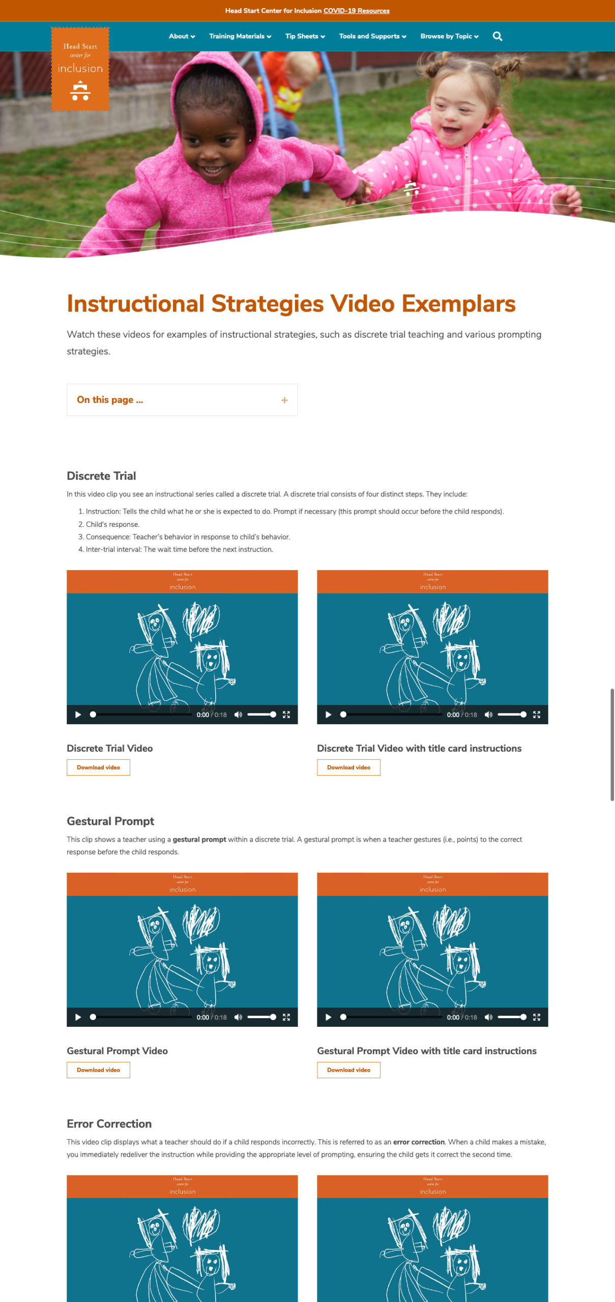
For videos, users are now able to:
- Read a description of the individual video or video collection.
- Easily scan videos with larger titles.
- Play videos onscreen (rather than clicking to a separate page).
- Download videos to their devices to take onsite with them or upload to a learning management system.
Example of Downloadable Materials
Example of Videos
Final Design and Build
Because meeting and obtaining approvals from leadership was limited, I used atomic design methodology to develop a design system and start the building blocks of the site. This allowed for continued progression of the design and development of the UI during delays in reviews and approvals between the university and Office of Head Start. It also allowed the fellow front-end developer and I to quickly build pages for the site. In addition to the visual design, the site was also built to meet WCAG 2.1 compliance.
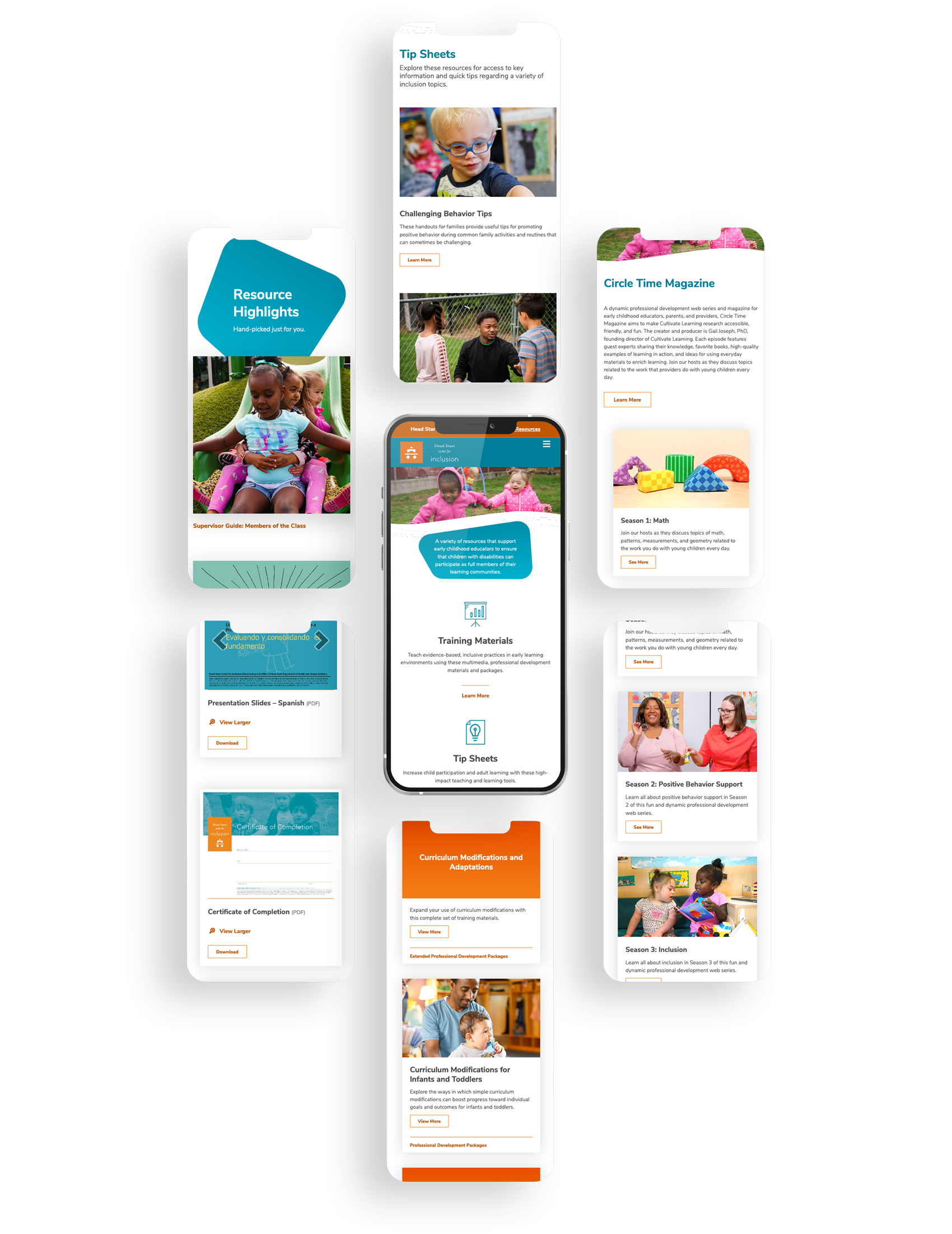
Responsive Design
Future Improvements
Improve Using Resources on Other Platforms
Add the ability to copy and paste embed codes for videos to allow trainers to add to their learning management systems.
Improve Ability to Find Resources
Experiment with filtering and sorting features for the "By Topic" section to allow users a quicker way to sort through all resources.
Improve Visual Scanning of Resources
Add a screenshot of the video to each video cover to allow returning users to quickly scan for the contents (like a familiar face) and reduce cogitative load.
© 2025 Stacey Berglind. All rights reserved.