Brown Giving
Brown University
UX design, UI design, front-end development
Not every design project gets a fresh start and you learn to get creative within restrictive parameters. This was certainly the case for this project. I was challenged to redesign the user experience and user interface of the giving website for Brown University. I had to strategically restructure the user’s experience using only CSS with minimal or sometimes no changes to the HTML or features of the existing form.

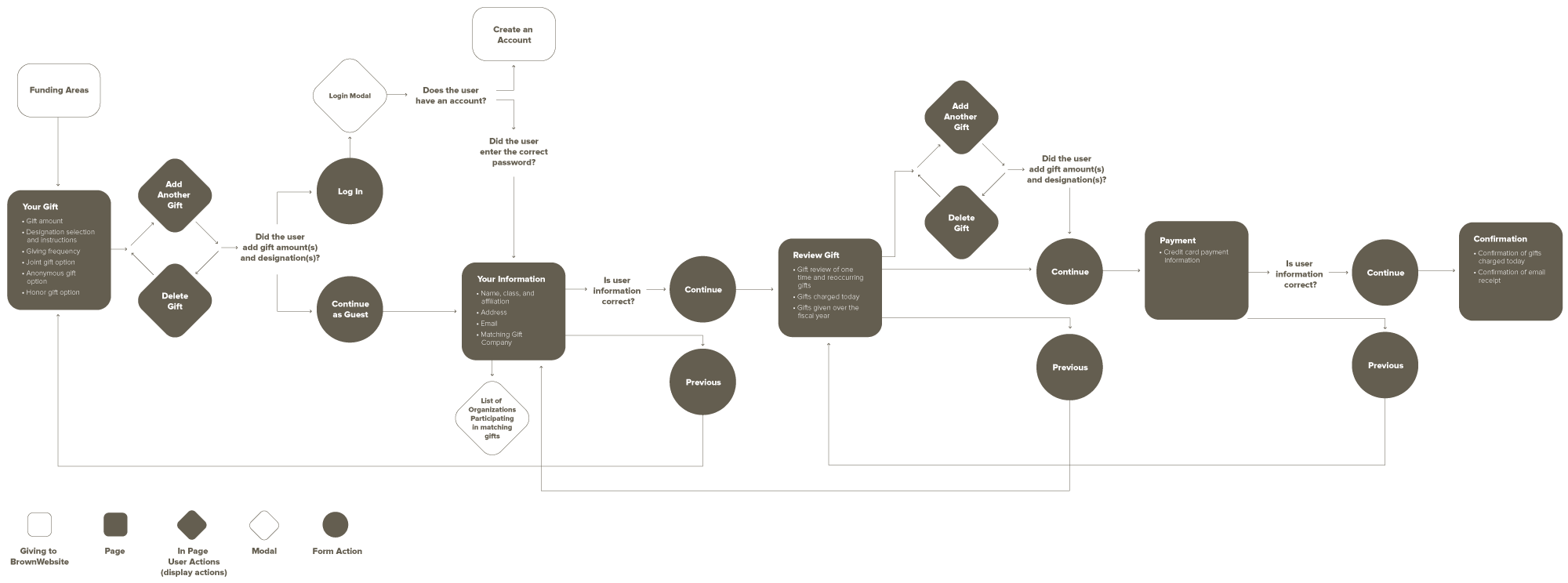
User Flow
My first step in this project was to identify existing user pain points as well as user goals. User pain points included problems finding form errors once they tried to submit their gift, adding multiple gifts, and reviewing their gifts (both annually and "today's gift"). The two main user goals included giving a one-time gift and making a reoccurring gift.
Step two in my process was a competitive analysis of other college giving sites such as Cornell, Harvard, and Stanford. Finally, I developed a user flow that laid the foundation for the design. This was crucial for the developer to see how existing form fields and validation were divided up across the different screens, and useful for leadership to understand the improvements of the user experience in this redesign.

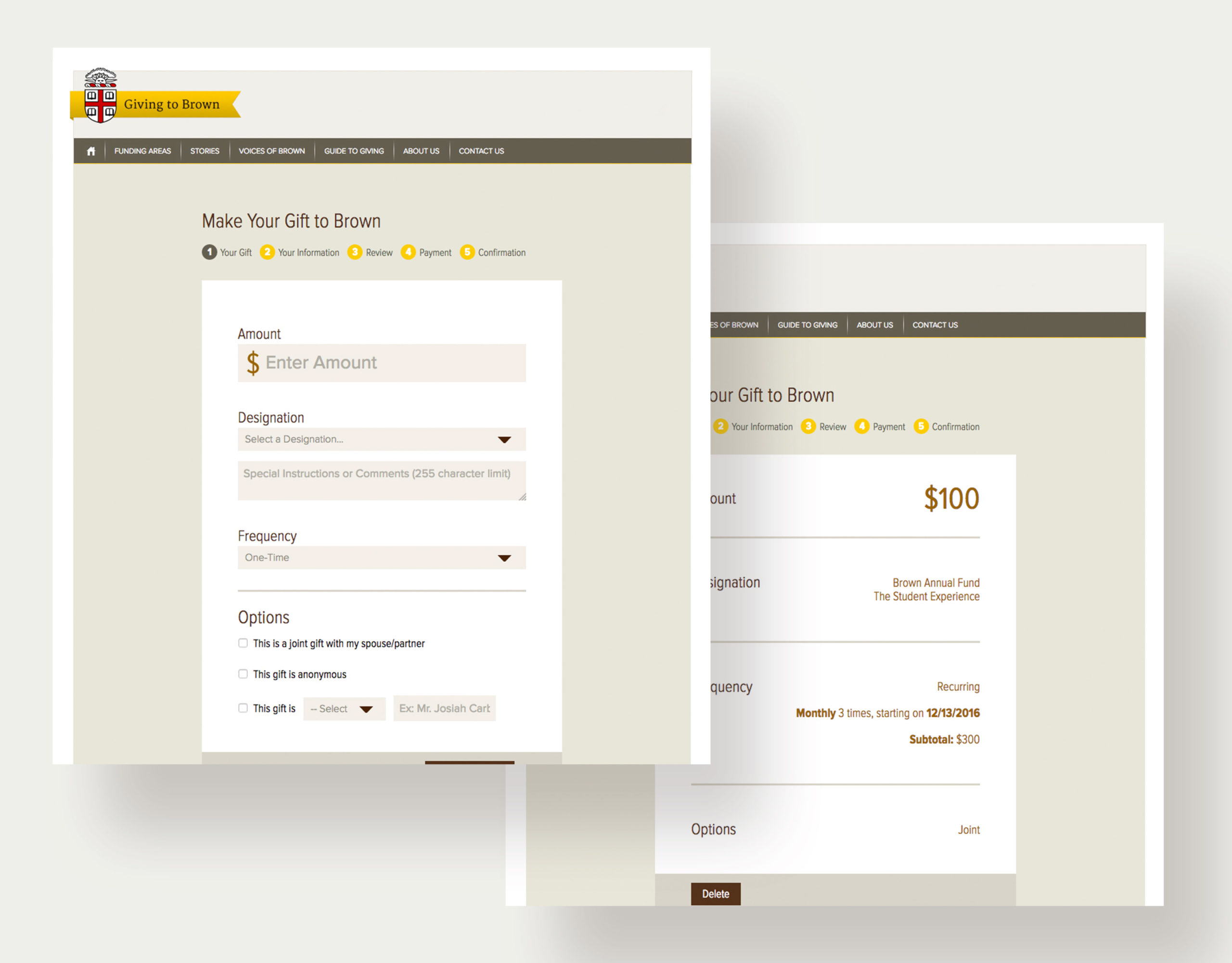
Once a single long form with heavy text instructions, the giving process was simplified by reorganizing the form into various steps, adding form validation in each step, and making it easy to add and delete gifts along the way. The outcome of these design upgrades? Final user testing validated that gifts were faster to complete, form validation errors were easier for users to find and fix, annual giving was comprehensive for users to review, and users were able to add or delete gifts in the gift review.
UI Design
Once the user flow was finalized, I designed high-fidelity prototypes. Due to the nature of the site, I worked closely with a developer to restructure the pages to match the new user flow. Then using the existing HTML and backend code, I did some CSS magic to transform the UI of the site to match my prototypes.
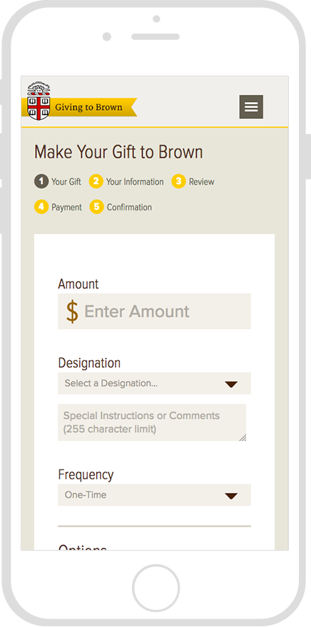
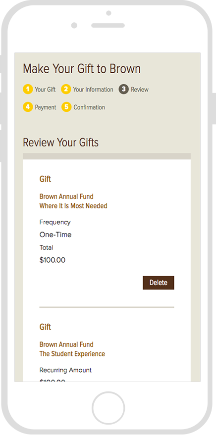
Responsive Design


© 2025 Stacey Berglind. All rights reserved.


